DESIGN CHALLENGE
This design challenge was too good and too fun not to share.
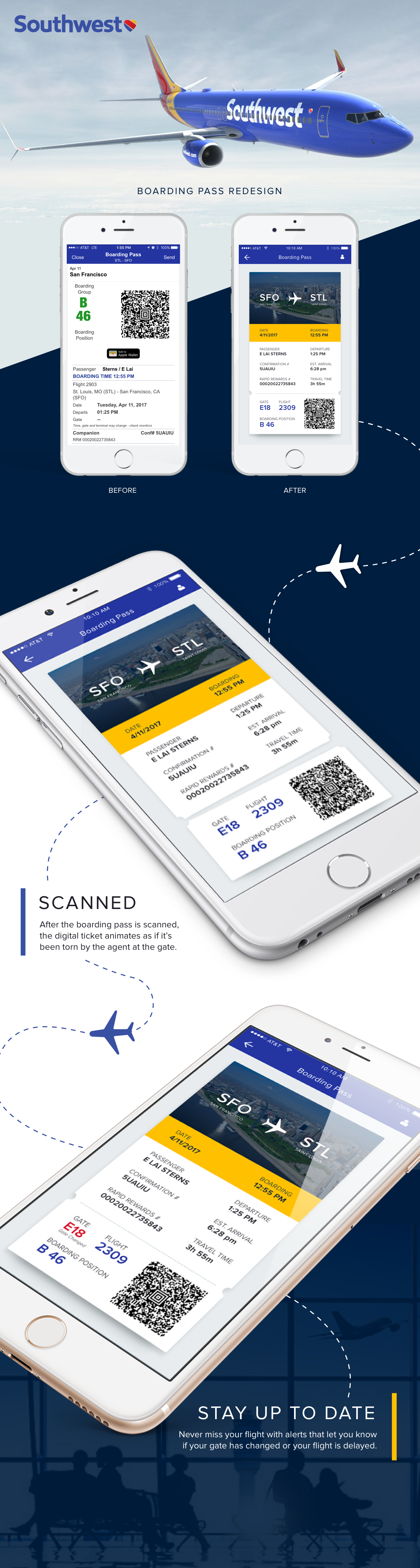
I was once tasked with redesigning the airline boarding pass.
The Background:
Redesign the airline boarding pass such that its simple to scan while providing key information upfront and being visually elegant. I could pick up any airline boarding pass as a starting example and the output could be in form of a mobile app.
Their Expectations:
They wanted me to express myself in this exercise, and be able to explain my choices and their impact.
They wanted to see how I organize the information architecture with user experience in mind while using my visual skills to make it simple and beautiful.
The airline:
I fly Southwest a lot and I’ve always loathed their user experience and design. Although, they have made recent updates to improve the experience. Still, there is room for improvement.
The Process:
Before you can come up with a solution you have to know what the problem is you’re trying to solve. So I made a list of UX fails and I quickly interviewed friends and colleagues about their experience using the Southwest app and boarding pass.
The problem:
- There were too many steps to get to the boarding pass.
- It wasn't clear if your gate changed or your flight was delayed.
- The hierarchy of information was disorganized and the callouts of that information were hidden.
- There wasn’t any visual design to make the information clear and feel delightful.
I then started researching and completing a competitive analysis (both direct and indirect competitors). I wanted to see if other companies found a better way to layout the boarding pass or if they suffered from the same problem. Turns out mobile boarding passes are almost like an afterthought to the overall design of the app.
The Solution:
- I began sketching out a couple of user flows reducing the number of steps a user has to go through to get to their boarding pass.
- Indicated in bold red when a gate has changed or a flight was delayed. Keeping the user up to date with every change of their flight status.
- I rearranged the hierarchy of information so that it was clear.
- Where they are flying to
- I created two columns to shorten the length of the page and to group the related information together. The date they are flying and the passenger information like their name, confirmation number, and rapid rewards number were aligned in the left column. The boarding time, departure time, estimated arrival, and travel time was aligned in the right column. Both the date they are traveling and the boarding time are highlighted at the top.
- The gate, flight, boarding position, and QR code were grouped below.
- Because boarding pass generally looks under designed, I wanted to make it more playful and delightful. I took a bit of a literal approach and made it look like an actual physical paper ticket. I even included a perforated bottom so that when a user scans their pass it animates and the bottom (gate, flight, boarding position and QR code) tears off.
Validation:
Because this was a quick design challenge I didn’t have the time or luxury to validate this new experience. However, I think there are some easy wins with this new design.